Monday, March 31, 2008

I-F: Homage (to mother earth)


This illustration was done by candlelight during Earth Hour on Saturday March 29th between 8 and 9pm. If you don't know what Earth Hour is, you should! You can find out more about it here.

It was great, we turned off the electricity to everything except the fridge, I painted at the kitchen table and A practiced the real piano instead of the electric one. We looked out the front door and the whole street was dark. I'm a big one for making a greener footprint as much as possible, so I hope this raised some more awareness.

ps. it is our suburb of Melbourne in the portion of street map used in this illo, and our street is even featured but I won't tell you where. I honestly chose this page at random (because I couldn't see much!) so quite the coincidence!!

Surprise Monday : Week 5 : Title page

Well I'm done with pretty much all the internals, and now get to do other fun things like the title page and cover. Karen and I are still discussing the cover a bit, so here are a few ideas for the title page.

I think whereas the cover has to be striking/interesting to make you pick up the book in the first place, the title page is a nice place to introduce the characters. For this book, that is a bit tricky because there are 4 main characters, and they don't actually meet in the book - they are all separate stories. so how could I link them together?

first i tried something like this, but it was a bit too boring.

then something like this but it was a bit too brady bunch:


There is a real giving aspect to this book, and I wanted to reflect that. But again because the characters don't actually meet each other in the book, I didn't want them meeting on the title page! So I came up with this...

which hopefully imparts the feeling that they are somehow connected, yet without ever actually meeting.
...
Last week, Isabelle asked me "I was wondering if you could talk about how you decide which "moments" to illustrate, if you talk this out with the author or if you make this call. How much of the finished layout of the book do you worry about at this point?"

These are great questions which I've been thinking about a lot. In my experience, it has always been left up to me to decide what to illustrate (and I like it that way!) although sometimes the author/editor will have ideas that they pass along but it is up to me whether I use them or not.

As for how I decide on what moments... that is a tough one. I suppose I tend to think more about what feeling i want to portray and then decide on a composition that relates that feeling, but also works with the text on the page, of course.

For instance, here is a spread that is a bit sad - Meg's dog had to go to the vet, so she is being consoled by her grandma. Regardless of what the text says exactly, the feeling I wanted was of something intimate and sweet. So I drew Meg sitting on her grandma's lap with a favourite toy, and we are quite close up to them in the frame to get that feeling of something private. And of course Meg's expression is a bit sad. I guess as long as you get the feeling right, the illustration will work with the text.


In terms of the finished layout of the book, I am always thinking about that as I am illustrating. I guess you tend to design the book as you go along, because you have to think about text placement and leaving space for it in the illustration. I am lucky that I also do graphic design so have the software to put a whole book together, and then can easily play around with the text and size/placement of illustrations. I asked the author what font and what size she would like to use early on so that I could work with that.

Sometimes you will find that you haven't left enough room and will need to adjust the illo accordingly. As you can see with the spread above, I left room on the left side of the right hand page. When I layed it out with the text, I found I had left more than enough room (for once!) which means I can add other little details in the final illo if I want. With this book there is also a designer involved so I have done a mockup of what I think works, but will consult with her before I start any final illustrations.

Hope that all makes sense and hope it was of some use! Thanks again for stopping by!

Monday, March 24, 2008

Surprise Monday : Week 4 : Composition

Welcome to Week 4 of Surprise Mondays! First of all let me say, I can't believe it's already week 4!! It's gone very fast, but I got a lot done this week so feeling good. I have one more double page spread to do, and then a few single page/spot illos and then I'm finished with the roughs!

This week I thought I'd focus on composition by taking a double page spread from storyboard to rough, and discussing why I made certain decisions.

As I talked about in my previous post, I start off with very quick storyboards that are only a few centimetres in length and take me about 30 seconds each. I might do upwards of 20 of these as the composition comes together. This spread is of a little boy who has just emptied his toys onto the floor, and his mum gets down a book for him to distract him.

ROUGH STORYBOARDS


I knew I wanted this illustration to take place in a kitchen. From this perspective we feel very far away from the action.


I brought the viewpoint a bit closer in.


I wanted the little boy Thomas to be more the centre of attention, so made him a bit bigger in the frame.


This is getting better, Thomas is more important in the spread because he is closer up, we are getting some good perspective in the cupboards, but they are leading our eye to the fridge, which is not very important in the spread! (maybe if the fridge was featured in an illustration later, this would work as a 'foreshadowing', but that isn't the case here)


Change of perspective to see if this works - (text in the bottom right hand corner) - this is nice as the cupboards lead our eye from Thomas to his mum, but then there's just a big hole at the end where we fall out of the illo. no good.


Tried a 'galley' style kitchen. This is good. Our eye starts at Thomas, leads into the illo, and then back out to the mum. The kitchen feels enormous though!


Brought it all in a bit closer. Feeling good.


Took out the cupboards in the upper left to make a bit more room for text. This is working! Time to go to the 'rough' stage.

ROUGHS

I print out a page template that has the exact dimensions of the book pages, and start where I left off with the storyboards - I sketch everything in very lightly and loosely, focussing on the major elements.


I start sketching in the characters more, and some of the angles. I have decided to go a bit 'quirky' with the angles and not worry to much about exact perspective. This has been a lot of fun and has let me be a lot freer when sketching.

This part was interesting. In all my storyboards, I had the mum reaching up to get a book down for Thomas, because that is what is in the text. But when it came to draw it, I couldn't make it work - it didn't seem right to have her back to us. I erased and redrew, erased and redrew, just couldn't get it right. As soon as I turned her around and drew it like this, it was obvious. And now it's got this nice playfulness of the boy giving her his toy and her giving him the book.


Done! Added a few details of his toys on the ground and trees out the window, but not much more at this point.


Did a few little fixes in Photoshop - I moved Thomas more into the centre of the page, and made both him and his mum a bit bigger.

Phew!

Well I hope this has been interesting/of some use to you out there? Or this is just way too much information? Please let me know if there's anything in particular you'd like me to talk about in this process too.

Have a great week!

Thursday, March 20, 2008

I-F: Heavy

I think these guys are a bit too heavy to get off the ground :-(

Monday, March 17, 2008

Goodies

I while ago I asked fellow Melbournian Julie Knoblock if she could custom make me one of her purses to a smaller size, and this week I met with her and got it and it is just so perfect! I love it! Unfortunately my camera is on the fritz and she's not selling them anymore in her store so I had to scan it - LOL! but at least you get the idea. it is very "me" and is just the right size.


Along with the purse, Jules tucked in a book about publishing in Australia, a cool postcard, and also this limited edition print which I love called 'Nesting' (very appropriate!) Thanks Jules!!


If you don't know Jules' work, she does fun quirky illustrations and is also a crafty one. Go check out her etsy shop and blog. Enjoy!

Surprise Monday : Week 3 : Let's get physical

Who said illustrating isn't active?

I know when I'm sketching characters, I'm constantly jumping up and striking different poses to see how something should look, or hand modelling (my least favourite thing to draw!) or contorting my face in the mirror to see different expressions or angles. Sometimes, the best way to make something look real is to DO it so you know how it feels!

One of the harder things to capture I think is perspective and foreshortening. For instance, for this little illo of Alice drawing, I was having trouble getting her legs behind her to look right. Because we are down at her level, there is a lot of foreshortening going on, so I ended up drawing this one the floor with a mirror in front of me in the exact same position!

The only problem with that is that you end up drawing yourself instead of your character, but if you're having trouble making it look 'right', it's the best way to solve the problem that I've found!
Here are some of my feet, you can see how I turned them into Alice's by just making them a bit rounder (and less bony! yes okay I have bony feet the secret is out :-P )
I didn't get much time to work on the book this week, but got a fair bit done today, even in the 39 degree weather (yes, celcius.) Ack! my house is like a sauna! I can't even sit and draw without the fan on me, and it's now 8:50pm. We have one room in the house which has an air conditioner but I always feel too guilty to use the energy to turn it on. Well, I succumbed tonight. But it looks like there is a cool change in sight thank goodness.

Tuesday, March 11, 2008

I-F: Garden


I wish there was one tree in my "garden", just ONE! But I don't think we can even call it a garden yet, it's more of a field. Yes... a blank canvas we keep telling ourselves... we can do whatever we want! but unfortunately (as much as we really love this house) just about EVERYTHING needs doing, and a garden is a bit further down the list. But it will be fun once we get to it!

Monday, March 10, 2008

Surprise Monday : Week 2 : first 2 spreads

This week I've been working on the first two spreads of the book. I wasn't sure if I would start out by doing all the storyboards and then all the roughs, but because the book is made up of four separate stories, it's easy to treat it that way. So i ended up doing the storyboards and roughs for the first story, pages 2-5.

I did sketches for some of the secondary characters, Hamish's dad and Alice's mum, but kept them quite quick, and let them develop throughout the storyboard process.

To start, I do extremely quick sketches of the major elements, just trying to get the composition right. I try different positions of people and objects, and different angles to view them from until something 'feels' right. I've got a pad of really poor quality A2 paper that I use for the storyboards, and for some reason I prefer sketching them in pen (it just feels better than pencil on this paper!) Plus, I'm doing them so quickly, so there is no time to erase anyway.

As I come up with a composition I like, I start to add more and more detail, as you can see towards the bottom of this page:


Once I've got the composition pretty set, I start to work on the rough. I make up a page template of the exact size in Illustrator, (just an outline of the page edges) and print it out so that I can sketch on top of it - just so that I am always working with the correct proportions for the page. For Surprise!, a double page spread is much bigger than an A4, but I only have an A4 printer, so I reduce it down. This means I am working much smaller than actual size for my roughs, but I will blow them up to actual size for when I do the finals. I tend to sketch quite small anyway so this works for me.

I might do one or two roughs. But I generally just work and rework one sketch. I erase and redraw A LOT! so sometimes it means when it's scanned in it's a bit hard to read, but that's okay. I just need the major lines, not all the little details. For instance, for page 2, I went from the storyboards above, to this:

to this:
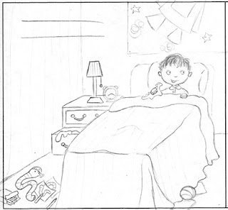
I always make sure to have the characters sketches that I did earlier close by to refer back to, to make sure I am getting my proportions right (as you can see in the first 'rough' above, Hamish's head was way too big!) Also you have to remember to leave room for the text! I often get carried away and forget that.

Sometimes with a rough, I will draw something that I quite like, but it is a little bit small or a little bit too much to the right, etc. That's where the computer comes in! It's great for moving things around and trying new things out quickly.

I'd be interested to know how other people do roughs. Do you use a page template or sketch free hand? Do you play around with your roughs on the computer afterwards if they don't fit quite right? Do you always 'know' when you find the right composition? Do you put all the details in in your roughs or do you leave that for the final so it is a bit more spontaneous?

Thanks for checking in. I hope you are enjoying this so far!

Next week: two more double spreads

ps. as you can see I've put a graphic in the sidebar where you can click to see all the posts on Surprise! at once x

Tuesday, March 04, 2008

I-F: Leap

I thought "Leap" was a pretty good word to continue with the Cat Circus theme from my last IF post...

She seems pretty confident about making the big leap. Ah, if only I could be that confident in real life sometimes! ;-)

I also couldn't resist sketching my cat who was posing ever so nicely for me, lying in a sunbeam as cats are wont to do...

Monday, March 03, 2008

Surprise Monday : Week 1 : Characters

Welcome to Week 1 of Surprise Monday!
Each Monday I will be giving a little behind-the-scenes look into my process in illustrating the book Surprise! for Miscellaneous Press (aka Karen Andrews).

This week I have been working on the main characters. For me it is really important to get to know the characters I will be illustrating as much as possible. I find that sometimes they take on a life of their own! I think the more you can draw them, the better you know them, so it's where I always start.

This book is sort of like 4 stories in one, with four equally important main characters - Hamish, Alice, Meg and Thomas. They are about 4 years old. Karen had provided a few notes on character traits, which helped a lot. Then, in reading the text over a few times, their personalities sunk in a bit more. I had pretty clear ideas of what I wanted for each character right from the beginning, except for Thomas, for some reason he was a bit harder. I wrote down several character traits, and kept referring back to them while sketching. I also looked at photos of 4 year olds to make sure I was getting the proportions right. Here is what I ended up with (with the character traits I used in the right hand corner):

When sketching, I mostly just did a lot of heads to try to capture the personality traits I had written down. For some, my initial ideas were it, but others surprised me. For instance, I was sure Meg was going to have pigtails, but once I drew this one (circled) I knew that was her.
It's weird creating characters, sometimes it's like they were always there, just waiting for you to find them. Does anyone else experience that or does that sound crazy? I promise I don't talk to them or anything! (not yet anyway!) Where do your characters come from? Do you like to draw them a lot first or just start the project and they evolve along the way? Do you use much reference or is it all from your head?

Next Monday:
Secondary characters and storyboards

Sunday, March 02, 2008

artful food

While I was in New York for the SCBWI conference, my lovely hubby went to his favourite American city, New Orleans, and brought me back this great cookbook from the chef of our favourite restaurant there, Bayona. There's this fantastic recipe I have to share with you because not only does it taste amazing, it also looks amazing... look at this!:


And it's so tasty, so fresh, so summery (and luckily it felt summery today for a 2-year-old's-birthday bbq and then a housewarming party, after wintry weather the last week). The interplay of tastes and colours is wonderful. It was inspired by a trip to Israel where it is quite common to pair melon with feta cheese. I tell you, it works!

Here's the recipe if you want to make it:
2 cups watermelon (pref seedless) diced
1 cucumber diced
2 cups arugula (aus: rocket) or spinach
1/2 red onion sliced very thinly
1/4 cup crumbled feta (bulgarian feta works well!)
dressing:
1 tbsp fresh lemon juice
2 tbsps fresh lime juice
2 tsps honey
1/3 cup olive oil
1 tbsp chopped fresh mint
pinch of cayenne
salt

mix it all together and yum!

and in other food news, we have been exploring our new surroundings and discovering all the best places to shop for things... good deli, good seafood place, cheap supermarket, etc. plus the BEST fruit and veg store which also has a fridge full of feta, haloumi, boccocini, etc. and a freezer full of paratha, naan, chapati, etc. and isles of lentils, nuts, dried fruit, etc. oh it's amazing! Plus it has THIS, my new favourite snack:


YUMMY turkish bread, with olive oil and dukka, it's the best.

ok, enough of food porn now, I think I've made myself hungry!