

*update, tuesday July 18, 3 days after original post (scroll down to see original)
I decided to try this one again. Much easier to compare apples with apples, no?
Looking at my original painting later, I wasn't totally happy with the colours - they weren't rich enough, so here I have made them more saturated, and added some dry brush for texture. I like this better, i think it adds to the drama of it.
Now for the black line. Well, harrumph, I'm still not happy with this, I may just have to do it AGAIN until I get it RIGHT. I'm not sure if it's the fact that they're in black or if it's just the lines themselves... I might try some different patterns, and also just breaking them up a bit here and there - the black still makes it feel heavy but at the same time I like the way it makes the colours pop...
don't think I'll make another I-F link but I will post here if I do it again.
-------------------------------------------------------------------------------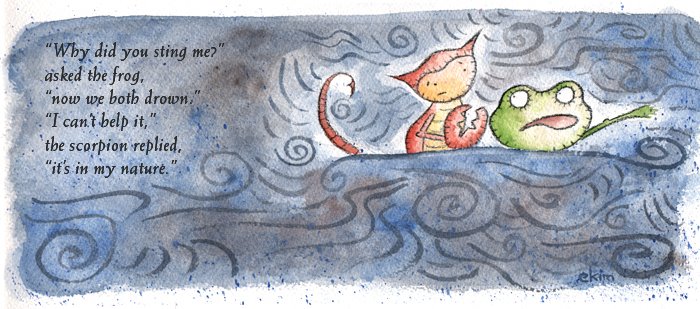
The Scorpion and the Frog
A scorpion and a frog meet on the bank of a stream and the scorpion asks the frog to carry him across on its back. The frog asks, "How do I know you won't sting me?" The scorpion says, "Because if I do, I will die too."
The frog is satisfied, and they set out, but in midstream, the scorpion stings the frog. The frog feels the onset of paralysis and starts to sink, knowing they both will drown, but has just enough time to gasp "Why?"
Replies the scorpion: "It's my nature..."
(okay so I used a bit of artistic license in my version)
----------------------------------
That's the inspiration for this piece, and I want to say a bit about the technique. I am getting increasingly happier with my gouache-that-look-like-watercolour backgrounds. They are a lot of fun to do. I tried to stay really loose on this one and not worry about outlining every single thing. Funny, as I was painting, I would catch myself going to paint around something oh-so-closely, and then think 'no! stop! keep it loose!' I guess it's not in my nature :-) but it is still something I want to try doing.
I tried the lines in a different colour this time, and no black border. I do like it better without the border - it lets it free (except that my scanner wasn't big enough and cut it off on the RHS...) The lines I painted too dark at first and had to blot them out a bit. Not too sure about them. The characters outlines I did with black coloured pencil and had to go over them a few times to make them dark enough. They're still not really dark enough in my opinion, but I hate going over lines more than once, it makes it looked contrived. So, some victories, some defeats. Try, try again....


A Year Ago…
3 years ago
25 comments:
i think ur lines that depict the current go well with ur background tones and the outline around ur characters is also just about right. not sure if a darker line would be called for since u want a loose feeling. nice work
You did a great job on this ~ I love the lines....it really looks like they're about the be swept away by a big wave.
This is great, love the looseness of this and it is perfect the way it is! :)
Beautiful Kim, I loved the story to go with your illo. Your style is awesome :-)
vfgreat piece! you even make a scorpion look cute! love it.
You knoe how to tug at those heart strings. Poor frog * scorpion :(
very nice pice but that is so sad.
Beautiful illustration!
nice nice work, love the watercolours! :)
M
Your colors are dreamy and you illustrations have soul!
Lol, wonderful illustration!
Perhaps it is also in the frog´s nature to be gullible? I mean, common, never trust a scorpio!
I think the line weight is just perfect. They still stand visibly out, but they don´t "overline" the illustration´s lightness.
After looking back and forth I like the changes you made, the colours pop more, and I see the frog's expression better. That poor frog.
That last comment was me - couldn't get the identity thingy to work - Kaya
sweet and lovely!! Wonderful take on the theme!
thats a great illo for sure ! I like it, its simple and colorfull !
VERY nicely done!
Kim, nice illo. And I really like that story! Very telling.
Wow! I admire you redoing a whole piece! Such persistence!
Great story!
I like the second better! Fantastic piece BTW!
Very Nice style! I liked the texture and the traditional media aspect you gave the image. Soft colors and very nice drawing
It looks better now, you're wright.
:))
This is a great story choice for the topic. I liked the first illustration, but you really have improved it a lot with the stronger colors and linework. Well done!
As always your illustrations continue to inspire me. Great!
Poor little frog.;(
I do like the updated version better.
there is more contrast and i like the loose feel of the black lines
Post a Comment