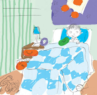
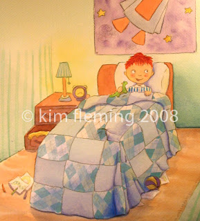
Well the exciting news is that Karen, the author of my latest illustration venture Surprise! has been signed to a literary agent in the big Big Apple, who is trying to find a publisher for the book in the US/Canada. You can see Karen's post about it here - fingers crossed for us please!
Also, the book got a nice one-liner review in Australian Bookseller and Publisher - I think that is my first ever review ... cool! :-)
I guess it's appropriate that I'm late for the IF topic 'Late'. This week's topic is 'repair' - um, so I suppose if the bough did break, there would be some repairs necessary? There you go. brilliant.
This is for my friend who is about to have a baby. I don't think she'll be so foolish as to put her baby in a tree top, but you never know.
Made fresh today using watercolours, coloured pencil, ink and collaged paper. (it's only a paper moon...) Hope you enjoy!
ps. I am having a giveaway of my latest children's book Surprise! - check out my earlier post if you would like to be in the drawing, and click on the graphic to the right to see the 'making of' xx
Last weekend was the official launch of my latest book Surprise! and I would have to say, it was quite the success. Music, a magician, cupcakes & lots of kids! what could be better than that? Here are a few pics:
Life is full of surprises. I haven't been blogging lately because I was off surprising by mother by arriving on her doorstep (from Melbourne, Australia to Portland, OR, USA) for her X0th birthday! (and I know she reads my blog so couldn't give any hint towards the trip here either!)
Today is the first day I feel myself standing a bit taller, breathing a bit deeper, unfurling from hunkering down through winter. It is such a good feeling. Bring on spring!
That said, I have been nose to the grindstone lately. I’m working madly on my book series every chance I get. I love it! One thing I’ve discovered: elephants are fun to draw. I must admit I was a bit worried about how to logistically place trunks in a composition so that they are not in the way, but I’ve found that they actually lend so much more emotion and expression. They are up in the air when all is well, drooping down in sadness, intertwining to show a connection between two characters, etc.
In between that and the rest of life, I have also taken on the task of painting our living room. It’s not as easy as I thought it would be! I was woefully unprepared for the endless scraping of cracks and sanding of walls in our 1950’s gem. (the painting part will be easy when we finally get to it!) Every time I start talking about this though I see people’s eyes start to glaze over so I think I’ll stop my whinging there! It will get done... One day... And it will be beautiful :-)
In other news, the author of my last book Surprise!, Karen, had a little talk at the Melbourne Writers Festival last week (you can see some videos of it on her blog, if you like). I went along and also got to see a positional proof of the book. Nothing to write home about really, I didn't get to see the printing proof unfortunately. Anyway, the good news is that they are due back end of September! Hooray! Get ready for some giveaways when that happens!
Well everyone, I am pretty much finished illustrating Surprise! Thank you so much to everyone who has been along for the ride - hopefully you have gotten something out of seeing a bit of my process.
That's right, only 2 more illustrations to go! and one is a redo of this image which was once the title page but is now the cover. I don't feel the way I did it was 'cover material' so I will redo and show it to you next week. A little poll: do you like how the boy on the left is reaching down towards the cat? (sort of like the cat is sniffing his fingers like cats do) I like the cat but for some reason I feel the sniffing thing looks funny. I'd like to change it but not quite sure what to do with his left hand. Any ideas?
Again I've been working hard but without much I can show you... I finished another double page spread and it is going really well. I now officially have 4 illustrations to go! It's very exciting! I'm hoping this means I will finish a bit ahead of schedule and have a bit of time to go over all the illos and do any touch-ups. I always like to have a bit of space and come back to things later if I can, to see it with a fresh eye.
This week I started doing the double page spreads of the book, of which there are only four. In Surprise!, each of four characters has 2 spreads dedicated to them, the first being a nice lingering double page spread to set the scene, and the second being single page and spot illos which are a bit faster paced. Normally, I would prefer to do the dps first, to make decisions on colour scheme, lighting, etc. before moving on to the more detailed illos. In this case however, I only got files back from the graphic designer last week to check text placement. It’s a good thing I waited too, because a few things had to change to make more room for text!
So it’s very exciting to be starting on the larger illustrations after a month of smaller spot illos. The dps are 250mm high x 462mm wide + bleed, so a pretty decent size! (the paper practically takes up my whole artboard!)
I've decided to combine my Suprise Monday, where I give an update on the progress of my current children's book, with my 21 days creative exercise post, because they sort of ran together today.
I must (ashmedly) admit that I haven't been able to keep up with the 21 days exercise - Some days, I just don't get into the studio at all, but then other days, I am able to play for longer than 15 minutes. Does that count? I don't think so. You're supposed to do it EVERY DAY. Sorry... :-(
BUT, I HAVE been doing it every day I'm in the studio though. As I've said before it really works for me to use it as a warm up. but today, something else happened...
And I don't have much I can show you from the book at the moment, (even though i've been working hard!) - I just don't want to give too much away. But I wanted to talk about the creative process and just how fluid and beautiful it can be. I'm always amazed when things jump out at me from the page, almost telling me what I should be doing with them, or reminding me that they are there, and that's what happened today.
I was working on the title for the book which I am doing by hand, and in trying a few different styles, I tried my beautiful japanese brush with ink:It just isn't the right feel for the book. But in doing this I squirted out waaay too much ink, and didn't want to waste it, so I grabbed some scrap paper and just started playing around. I have this little painting of bamboo that I got in San Francisco and tried copying it.
I took one japanese calligraphy class ages ago, and I loved it, and this reminded me about the beauty, the simplicity of monotone colour and quick strokes. Not thinking so much, just doing. It's another thing I'd like to get back to and play with. all in good time....
But I guess it was just another reminder to go with those little whims, like I did the other week with the collage for the book, because you never know where it is going to take you, and all of a sudden you have added another dimension to your work, or you are going in a completely different direction than you thought you would be or should be, and that is the fun of creating!
I just want to say thank you to everyone for all of your comments, and I'm so sorry I haven't been able to make the rounds lately... I can't wait to get a bit more time to check in on what you've all been doing!! Happy creating everyone! :)
Well I'm getting to the point where it's difficult to show you very much! I'm trying to stick to the illos I've already showed you the sketch of.
This one takes place in the kitchen scene, and I showed you how I came up with one of the kitchen sketches here. I've been having lots and lots of fun with collage and I feel like it's really adding a new dimension to the book. I am using it as little accents in a scene, and don't want it to overpower the characters.
So what I'm doing is sticking down a bit of patterned paper using craft glue, and then painting on top of it with acrylics. I use Titanium white to partially obscure the paper so it doesn't stand out too much, (and actually I realise you can't see the collage much at all in this scan!) - but then on top of that I use this "mixing white" that I talked about in an earlier post.
I mix the "mixing white" with whatever colour I need to blend it with (in this case, Lemon Yellow) and because the white is so transparent, it's like painting a 'wash' over the paper! It's really cool! and I think it helps blend the collage in with the rest of the painting, so it doesn't just jump out as 'oh, there's a bit of paper stuck on there.' I'm having a lot of fun with it and I think it's now one of my favourite parts!!
I'm pretty much on track with all the illos and they are going well. I've been focusing on all the spot illustrations, and soon will start on the double page spreads. It's very satisfying to see my little folder of final illustrations growing. wohoo!
Thanks again for checking in everybody, your encouragement is much appreciated! :)
When using watercolours, it's all about layers. Coming from an oils background, that was a hard thing to learn, especially to learn that you start with light colours first and gradually get darker. Here's a little in-progress of the character Alice, a sketch i showed you here.
Once the sketch is finalised i trace it onto 300lb Arches watercolour paper using my lightbox.
i tape the illo to my table and get to work! as always with my character sketches (in this case title page illo) close at hand for consistency
i do a background wash then start on skin tones which i use the most layers on, this one has 4-5 layers. Monica had asked me about maintaining consistency of colour throughout a book. I find that hard sometimes too. for the most part I use colours 'straight out of the tube' and might only mix two colours together so it's not so bad, but have had lots of problems getting Alice's skin tones right in each illo. I guess I just try to remember how I did it last time and approximate... not the most scientific of ways I guess, but i find i can usually get close enough. Of course your background affect how other colours look to0 so you have to keep that in mind... i don't think that was any help to you though, sorry Monica!then colour in everything else which for this small illo has 2-3 layers (highlight, middle tone, shadow)
in this case i didn't like the colour i painted the rug so decided to incorporate collage! i like the richness of it, and had talked about doing this with Karen. i'm now using collage in the rest of the illos too which adds a great last 'layer' i think.
i draw or paint on top of the collage too.
Here are all my materials. i've got lots of brushes i never use, and mostly just stick to the ones laid out there by my palette: India Sable brushes, 8, 10 & 12, a W&N probably about #4, a beautiful japanese brush which has a great point on it for doing detailed work, and coloured pencils for the outlines (previously I've used a lot of painted black ink for linework but am trying to move towards something a bit softer) - I've been using some acylics on top of the collage and use W&N paint and flat sable brushes for that.
I'm not going to delve into much more that this point cause I'm really tired... and hungry! My New Orleans red beans & rice is calling me so I'll make a quick getaway! but any questions fire away and I will answer them next time. xx
Well I finally got to delve into some colour this week.... aaah... so satisfying.
Normally the first thing I would do is a colour study of all the characters and have it pinned up on my drawing table for the duration of the project, so that I am always referring back to correct proportions, colours, etc. In this case, the title page illustration serves that purpose really well, so I did that one first, as you can see here (sorry for terrible photo! - the colours are really bad, esp of their hair)It's always so fun to 'meet' the characters in colour - their personality really comes alive...
There have been a few hiccups this week - the designer hasn't been able to open my InDesign files for some reason, so I don't know yet whether I've left enough room for the text in the illos. This most affects the pages with illustrations across the double-page spread, which is about half of them, so I've been able to start on any spot illustrations, but it's not the way I prefer to work. I like working from start to finish basically, and that way I get a really good feeling for the story. At the moment I feel like I'm putting the cart before the horse but that's okay - it's still fun and I just need to keep going with it.
I've worked out I need to be doing 2 illustrations a week, where 1 illustration can either be 1 double page spread, or 1 page with potentially 4-6 spot illustrations on it. eek! This would all be okay if I didn't also have a 3 day/week day job and still trying to have some semblance of a life! That's not true, it's still all okay, but no rest for the wicked as they say!
The other 'hiccup' has been with the cover. It is still not finalised and both Karen and I are unsure about it. I had been meaning to paint that first so that Karen could use it for publicity and distribution. but it is on hold for the moment as we mull it over. I'll keep you posted on this one. baby steps, baby steps :-)
Hope you're all having a great week and I promise to have more images for you next time! I meant to take photos of my process but forgot - I'll show you that next week and talk about what materials I use in painting.
Cheers
The meeting with Karen and her designer friend on Thursday went well, and I have left the dummy with Karen to mull over, so I'm afraid I don't have any images for you this time. Karen came back with a few changes to some of the illos, but nothing major. (yay!)
It's all coming together now! I've got a meeting with Karen, the author, this Thursday, to show her all the roughs, so I'm busy just tying up all the loose ends. In the next few days I will be making a dummy to show Karen all the illos in true book form! It's very exciting! She got a dummy of the printing/binding sent through from the printer in Taiwan - so basically a blank book but the exact dimensions and quality of the final one. So it will be great to make my dummy in this. I'm just printing out the illos which I've layed out with the text and sticking them in. This isn't how I'll do it for the final one but just thought I'd give you an idea of what it looks like (I blurred out the text though so it's still a 'Surprise'! sorry for the bad photo)This week I worked on the cover which didn't come easily at first. Sometimes a cover idea comes to the forefront during the book process, but this time it didn't. Karen and I bounced ideas off each other, sent sketches back and forth, but it wasn't happening. I found myself doing little thumbnail sketches everywhere I was, and finally came up with something that fit well. Of course I can't give it away, you'll have to wait for the surprise!
Last week Isabelle asked me 'When you illustrate one story, do you tend to make a cover from scratch or to choose a scene that sums up the story well?' - personally I like to create an illustration that is uniquely for the cover. It has to be something that represents the entire book, gives you a glimpse into the mystery of the book, and is engaging and eye-catching all at the same time! I think it would be hard to find an internal illustration that did all that. Especially for this book - seeing as there are four characters who never meet, it would be hard to have an internal illo on the cover. What do others do? would love to hear...
So that's it for the roughs pretty much! I may do another quick post before Thursday to show you how the dummy turns out. And soon I'll have something to show you in colour!! Have a great week all xx
Well I'm done with pretty much all the internals, and now get to do other fun things like the title page and cover. Karen and I are still discussing the cover a bit, so here are a few ideas for the title page.
I think whereas the cover has to be striking/interesting to make you pick up the book in the first place, the title page is a nice place to introduce the characters. For this book, that is a bit tricky because there are 4 main characters, and they don't actually meet in the book - they are all separate stories. so how could I link them together?
first i tried something like this, but it was a bit too boring.
then something like this but it was a bit too brady bunch:
There is a real giving aspect to this book, and I wanted to reflect that. But again because the characters don't actually meet each other in the book, I didn't want them meeting on the title page! So I came up with this...
which hopefully imparts the feeling that they are somehow connected, yet without ever actually meeting.
...
Last week, Isabelle asked me "I was wondering if you could talk about how you decide which "moments" to illustrate, if you talk this out with the author or if you make this call. How much of the finished layout of the book do you worry about at this point?"
These are great questions which I've been thinking about a lot. In my experience, it has always been left up to me to decide what to illustrate (and I like it that way!) although sometimes the author/editor will have ideas that they pass along but it is up to me whether I use them or not.
As for how I decide on what moments... that is a tough one. I suppose I tend to think more about what feeling i want to portray and then decide on a composition that relates that feeling, but also works with the text on the page, of course.
For instance, here is a spread that is a bit sad - Meg's dog had to go to the vet, so she is being consoled by her grandma. Regardless of what the text says exactly, the feeling I wanted was of something intimate and sweet. So I drew Meg sitting on her grandma's lap with a favourite toy, and we are quite close up to them in the frame to get that feeling of something private. And of course Meg's expression is a bit sad. I guess as long as you get the feeling right, the illustration will work with the text.
In terms of the finished layout of the book, I am always thinking about that as I am illustrating. I guess you tend to design the book as you go along, because you have to think about text placement and leaving space for it in the illustration. I am lucky that I also do graphic design so have the software to put a whole book together, and then can easily play around with the text and size/placement of illustrations. I asked the author what font and what size she would like to use early on so that I could work with that.
Sometimes you will find that you haven't left enough room and will need to adjust the illo accordingly. As you can see with the spread above, I left room on the left side of the right hand page. When I layed it out with the text, I found I had left more than enough room (for once!) which means I can add other little details in the final illo if I want. With this book there is also a designer involved so I have done a mockup of what I think works, but will consult with her before I start any final illustrations.
Hope that all makes sense and hope it was of some use! Thanks again for stopping by!
Welcome to Week 4 of Surprise Mondays! First of all let me say, I can't believe it's already week 4!! It's gone very fast, but I got a lot done this week so feeling good. I have one more double page spread to do, and then a few single page/spot illos and then I'm finished with the roughs!
This week I thought I'd focus on composition by taking a double page spread from storyboard to rough, and discussing why I made certain decisions.
As I talked about in my previous post, I start off with very quick storyboards that are only a few centimetres in length and take me about 30 seconds each. I might do upwards of 20 of these as the composition comes together. This spread is of a little boy who has just emptied his toys onto the floor, and his mum gets down a book for him to distract him.
ROUGH STORYBOARDS
I knew I wanted this illustration to take place in a kitchen. From this perspective we feel very far away from the action.
I brought the viewpoint a bit closer in.
I wanted the little boy Thomas to be more the centre of attention, so made him a bit bigger in the frame.
This is getting better, Thomas is more important in the spread because he is closer up, we are getting some good perspective in the cupboards, but they are leading our eye to the fridge, which is not very important in the spread! (maybe if the fridge was featured in an illustration later, this would work as a 'foreshadowing', but that isn't the case here)
Change of perspective to see if this works - (text in the bottom right hand corner) - this is nice as the cupboards lead our eye from Thomas to his mum, but then there's just a big hole at the end where we fall out of the illo. no good.
Tried a 'galley' style kitchen. This is good. Our eye starts at Thomas, leads into the illo, and then back out to the mum. The kitchen feels enormous though!
Brought it all in a bit closer. Feeling good.
Took out the cupboards in the upper left to make a bit more room for text. This is working! Time to go to the 'rough' stage.
ROUGHSI print out a page template that has the exact dimensions of the book pages, and start where I left off with the storyboards - I sketch everything in very lightly and loosely, focussing on the major elements.
I start sketching in the characters more, and some of the angles. I have decided to go a bit 'quirky' with the angles and not worry to much about exact perspective. This has been a lot of fun and has let me be a lot freer when sketching.This part was interesting. In all my storyboards, I had the mum reaching up to get a book down for Thomas, because that is what is in the text. But when it came to draw it, I couldn't make it work - it didn't seem right to have her back to us. I erased and redrew, erased and redrew, just couldn't get it right. As soon as I turned her around and drew it like this, it was obvious. And now it's got this nice playfulness of the boy giving her his toy and her giving him the book.
Done! Added a few details of his toys on the ground and trees out the window, but not much more at this point.
Did a few little fixes in Photoshop - I moved Thomas more into the centre of the page, and made both him and his mum a bit bigger.
Phew!
Well I hope this has been interesting/of some use to you out there? Or this is just way too much information? Please let me know if there's anything in particular you'd like me to talk about in this process too.
Have a great week!
Who said illustrating isn't active?
I know when I'm sketching characters, I'm constantly jumping up and striking different poses to see how something should look, or hand modelling (my least favourite thing to draw!) or contorting my face in the mirror to see different expressions or angles. Sometimes, the best way to make something look real is to DO it so you know how it feels!
One of the harder things to capture I think is perspective and foreshortening. For instance, for this little illo of Alice drawing, I was having trouble getting her legs behind her to look right. Because we are down at her level, there is a lot of foreshortening going on, so I ended up drawing this one the floor with a mirror in front of me in the exact same position!
The only problem with that is that you end up drawing yourself instead of your character, but if you're having trouble making it look 'right', it's the best way to solve the problem that I've found!
Here are some of my feet, you can see how I turned them into Alice's by just making them a bit rounder (and less bony! yes okay I have bony feet the secret is out :-P )I didn't get much time to work on the book this week, but got a fair bit done today, even in the 39 degree weather (yes, celcius.) Ack! my house is like a sauna! I can't even sit and draw without the fan on me, and it's now 8:50pm. We have one room in the house which has an air conditioner but I always feel too guilty to use the energy to turn it on. Well, I succumbed tonight. But it looks like there is a cool change in sight thank goodness.