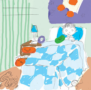
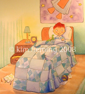
This week I started doing the double page spreads of the book, of which there are only four. In Surprise!, each of four characters has 2 spreads dedicated to them, the first being a nice lingering double page spread to set the scene, and the second being single page and spot illos which are a bit faster paced. Normally, I would prefer to do the dps first, to make decisions on colour scheme, lighting, etc. before moving on to the more detailed illos. In this case however, I only got files back from the graphic designer last week to check text placement. It’s a good thing I waited too, because a few things had to change to make more room for text!
So it’s very exciting to be starting on the larger illustrations after a month of smaller spot illos. The dps are 250mm high x 462mm wide + bleed, so a pretty decent size! (the paper practically takes up my whole artboard!)

In Photoshop, I use my rough sketch on the bottom layer, and paint colour on a higher layer which is set to ‘multiply’ to let the sketch beneath show through. Here is one half of the first dps with Hamish - I showed you the sketch of this one here (I can’t show the other half of the spread without revealing something important about the story – sorry!)
From there it’s on to painting. Once I’ve gotten a bit further into the painting I might come back to the colour study and add a few more details to make sure it will all balance out. But mostly it’s just painting, painting, painting.
It took me two days of solid work to finish this one, (you can read about Day 1 of it here). I am super happy with how it turned out! – especially the collage which you can see better here than in my last post about collage.. This has left me really energized and excited to work on the next dps....!
 (as always, sorry about the colour, a heavy yellow tinge from taking the photo - it wouldn't fit in my scanner!)
ps. due to things like the orphan works bill as well as many stories about art being stolen over the internet, I have decided to post my images at a lower resolution and to start watermarking them (the ones that matter anyway!) I hate to have to do this but it's probably better to be safe than sorry you know?


9 comments:
Wooohooooo AWESOME!!!!!!! That is gorgeous Kim!!!! So beautiful. You should be proud my friend! I know I am so proud of you! :o)
Wow Kim, it's really coming along beautifully! You are so mysterious about some aspects of the book, I am all curious!!
When do you expect to have it out?
OMG! the final piece is Superb!
Thanks for sharing, I bet I sure learn some tips here!
I totally agree with your watermark protection.
Hi Kim...this is a wonderful piece...lovely colours and great layout....thanks for sharing....
Its wonderful to see your photoshop color study and then the final! Thanks for sharing.
Wonderful progress. So neat to see it move along. I assume the collage is the pattern in the blanket. Looks really good!
What a lovely illo, Kim, and again it was wonderful to see how you got there. This is going to be such a cute book, I can tell by just looking at your illustrations! :-)
Hey Kim! What version of PS are you using? I have CS, and when I set my color layer to multiply, it doesn't do anything that I can see. I was just curious to see if your way is better than mine, which is to create a color layer to paint on, and then turn it's opacity down to 70-80%.
Also, I didn't know you were in Portland. I'm just north of there, north of Vancouver, Wa. Stay dry, looks like another cool wet day today.
Thanks everyone! will be around to check out your 21 days (which I have so far failed to complete - bad me!) very soon!! x
Post a Comment