
I have always admired and loved japanese and chinese art. the dark black against the bright white, the simplicity, the strength, the confidence of brush stroke, the bold use of limited colour, the peace. When I saw a japanese calligraphy class advertised in my local art supply store, first class free, all materials supplied, only two blocks away from my house, I couldn't resist.
I went yesterday for my first introductory class. It was just two other students, Sally and Pete, and the teacher, Junko, and I. It is conducted in the front room of her house where the walls are adorned by beautiful long scrolls made of kimono material, with large kanji characters on rice paper in the middle, origami characters and little poems framed in bamboo, some so graceful, some just plain cute. She had books filled with the 3000 kanji characters written in up to 6 styles, the different types of calligraphy developed as successive emperors made their marks on their people.
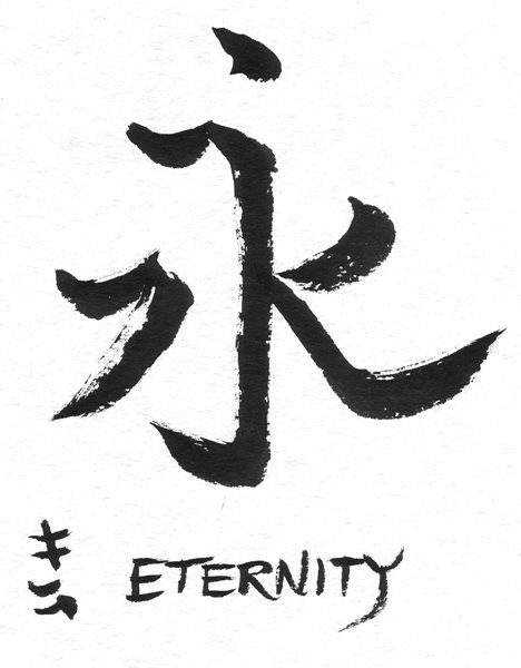
We drank green tea and I looked at the materials in front of me. a long pointed brush, already wet, a little stand for the brush, a well for the sumi ink, a metal 'paperweight' pinning down the sheet of white rice paper. so daunting that little piece of paper. Each student practiced a single character for the entire hour. My character was 'eternity' made up of 8 strokes. Each stroke must be done in order. Junko showed me gracefully how to do this. My first one was horrible! She told me I should paint with my arm, not with my wrist, that the brush should never twist and should always be held at a 45 degree angle to the paper - you let the bristles do the work for you. My last attempt at 'Eternity' was pretty good. She taught me to write my name and gave me a little red stamp (like a gold star!) and said I did very well for my first time!
I left everything there because it was raining so much and I didn't want it to get wet, so I came home and tried it again, before I forgot how to do it. I dug out a chinese calligraphy brush I got as a present ages ago and used my trusty ol india ink - above is my best result yet!
I love the way you can see the brush strokes, I think that's because this is on watercolour paper as opposed to very smooth rice paper, so it is picking up that texture. The little symbols in the left hand corner is my name (Ki-mu) - which I didn't do very well. I also don't really like my name, it's boring, so next time I might see if there's another way to write it. (yes, I think I will go back!)
Interestingly, last night as I was doing my I-F piece, I could already feel the influence of the japanese calligraphy in my painting. I think it will affect it in a good way.


A Year Ago…
3 years ago
1 comment:
For a first-timer, this is excellent! Keep up the good work!
Post a Comment